TeX: A tale of two worlds
Best viewed in Internet Explorer 6
PDF
because… well… read the damn thing.
Most serious programmers have heard of Donald Knuth, the man who coined the term analysis of algorithms in 1968 and pioneered many of the computer science fundamentals we use today. Knuth is perhaps most famous for his ongoing magnum opus, The Art of Computer Programming.
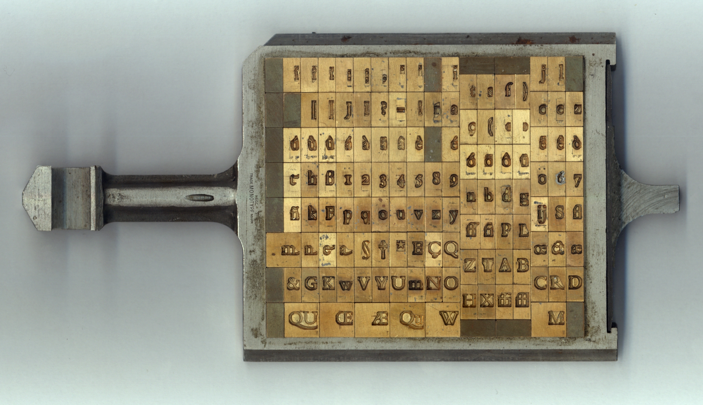
When the first volume of TAOCP was released that same year, it was printed the way most books had been since the turn of the century: with hot metal type. Each individual letter was cast from molten lead, then arranged into its line.

These lines were clamped together to form pages of the book, which were finally inked and pressed against paper. By March of 1977, Knuth was ready for a second run of TAOCP, Volume 2, but he was horrified when he received the proofs. Hot metal typesetting was an expensive, complicated, and time-consuming process, so publishers had replaced it with phototypesetting, which works by projecting characters onto film. The new technology, while much cheaper and faster, didn’t provide the same level of quality he had come to expect.
The average author would have resigned themselves to the change and moved on, but Knuth took great pride in print quality, especially for the mathematics in his books. Around this time, he discovered an exciting new technology: digital typesetting. Instead of working with metal or film, letters and shapes were built from tiny dots, often packed together at over 1,000 per inch. Inspired by this burgeoning tech and frustrated with the current state of affairs, Knuth set off on one of the greatest yak shaves of all time. For years, he paused all work on his books to create his own digital typesetting system. When the dust settled in 1978, Knuth had the first version of TeX .1
It’s hard to understand how much of a revolution TeX was, especially looking back from a time where anybody with a copy of Word can be their own desktop publisher. Adobe’s PDF wouldn’t exist for another decade, so Knuth invented a device-independent format, DVI. Scalable fonts were uncommon at the time, so Knuth created a system, , to rasterize his characters into dots on the page.2 Perhaps most importantly, Knuth and his graduate students designed algorithms to automatically hyphenate and justify lines of text into beautifully-typeset paragraphs.
Here is where the timelines diverge. In one, TeX was just the beginning. Computer typography evolves rapidly as the decades go by, building on Knuth’s prior work and taking advantage of the million-fold increases we’ve seen in computing power. Browsers, e-readers, and word processors deliver beautiful type to every person who looks at a screen, with almost no effort from authors.
In the darker timeline… none of this happens. TeX is still some of the best we’ve got for computer typesetting. It’s seen some impressive improvements,3 but its core hasn’t changed much in decades. To this day, it doesn’t lay out more than one page at a time because 1980s computers didn’t have enough RAM to do any better.4 Almost no other software—except for a handful of professional layout programs like Adobe InDesign—leverages any of the advances TeX made in line breaking and hyphenation. Layout in Word, browsers, and even e-readers is a sad joke.

I’m not sure what to make of this. Maybe most people, outside a small cadre of designers and enthusiasts, just don’t care about typography very much. After all, the human brain is incredibly good glossing over minor details and imperfections when reading. But even the design world seems largely unaware or indifferent to Knuth’s work. Despite collaborations with famous type designers like Hermann Zapf, you’ll find no mention of him in renowned books and documentaries on the subject.5 And parametric font families—just like the ones offered in 1983—are heralded in 2017 as “a new era of type design”.6 It’s bizarre.
Good typography can make almost anything more enjoyable to read, and it feels like such a shame that better layout isn’t available to the masses when so much of the groundwork was laid almost forty years ago. In an age when the average American reads from a screen they keep in their pocket dozens of times a day, and where each one of those devices holds more processing power than you could fit in several rooms back when Donald Knuth wrote TeX , surely we can—and should—do better.
-
TeX is pronounced like the first syllable of ‘‘technician’’. ↩
-
In some ways, is more impressive than the PostScript system that underpins modern TTF and OTF font files. Instead of constructing characters from lines and curves, uses strokes of virtual pens. By tweaking the parameters of these pens and strokes, one can build entire font families from the same base designs. ↩
-
LuaTeX, XeTeX, and
microtypeare great examples. ↩ -
No, seriously. “The computer doesn’t have enough high-speed memory capacity to remember the contents of several pages, so TeX simply chooses each page break as best it can, by a process of ‘local’ rather than ‘global’ optimization.” — The TeX book, p. 110 ↩
-
e.g., Thinking With Type, The Elements of Typographic Style, The Visual History of Type, Graphic Means: A History of Graphic Design Production… ↩